Designing a UI when your users live in the terminal
When CockroachDB started, the only way to interact with it was through the command line. The Admin UI grew out of internal tools the engineering team built to debug performance during development.
The Observability team at Cockroach Labs redesigned the Admin UI to give developers what they need to monitor performance and troubleshoot their cluster. Three things we learned along the way:
- Study existing developer workflows
- Incorporate help messaging and leverage docs
- Test solutions early with coworkers
1. Study existing developer workflows
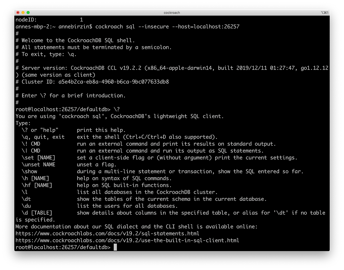
Developers work with a large ecosystem of tools to interact with a database. One of the main ones is CockroachDB’s command line interface (CLI), which they use to execute SQL statements and issue commands. We had to account for those workflows when designing the Admin UI, because actions taken in the CLI surface in the UI.
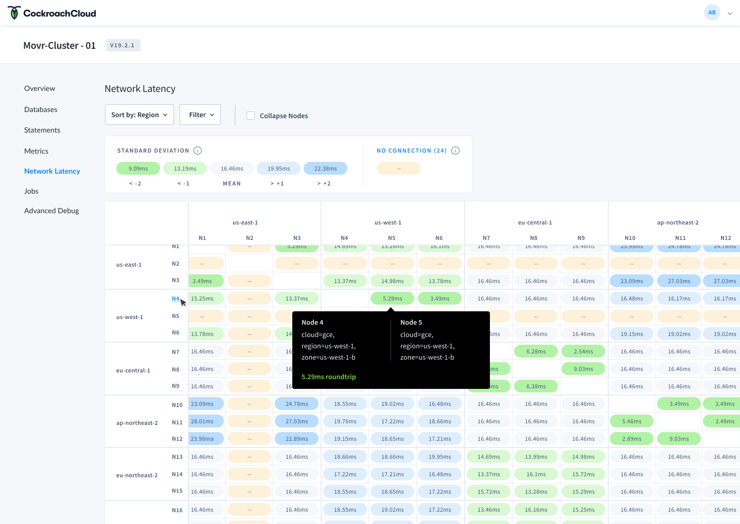
Designing the Network Latency page
The Network Latency page displays round-trip latencies between localities in a cluster. It helps developers spot high latencies between nodes or regions, which can slow down their application.
When setting up a cluster from the CLI, developers can add localities that influence where their data lives. These can include tiers for region, country, datacenter, rack, and so on. A typical configuration might include:
- 3 regions for US east, US central, and US west
- 3 tiers for Cloud, Region, and Zone
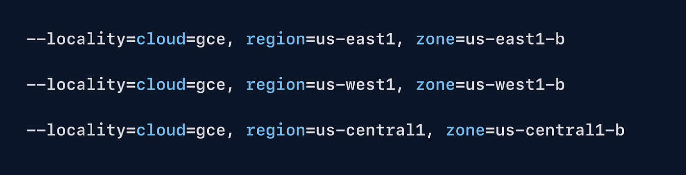
Once configured, those localities surface in the Network Latency page.
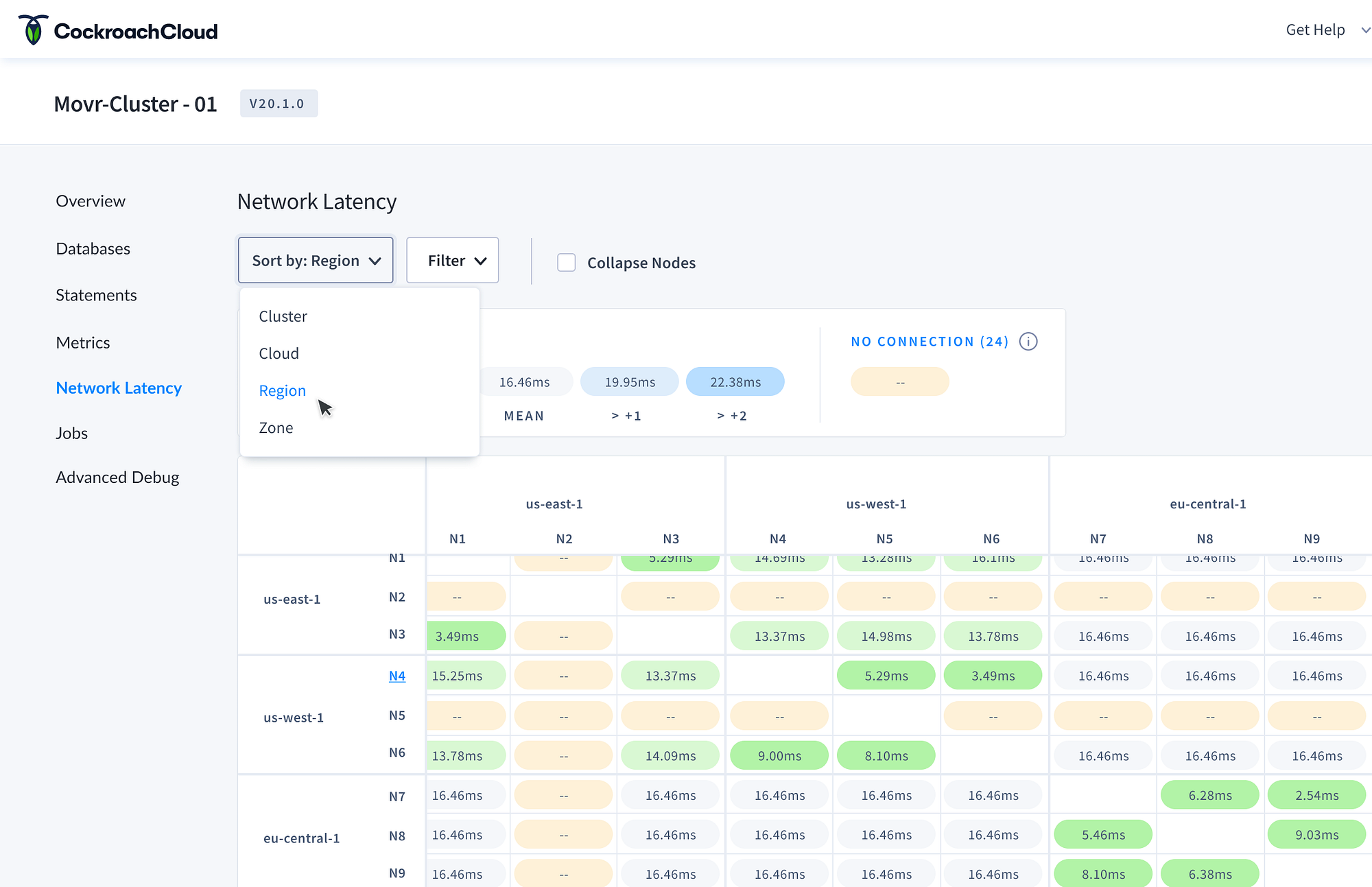
The CLI configuration shows up in two places:
- Localities for
us-east1,us-west1, andus-central1appear across the x/y-axis, giving developers a way to see roundtrip latency between regions. - The ‘sort by’ dropdown lets developers pivot the matrix between locality tiers like Cloud, Region, or Zone.
By accounting for the configurations developers create in the CLI, we built a page that surfaces them directly, making it easier to spot high-latency regions and improve application performance.
2. Incorporate help messaging and leverage docs
Developers rely on documentation, and its quality can make or break the experience. Cockroach Labs has built a library of articles, references, and tutorials to help developers get started and maintain their database.
We knew users were bouncing between the product and the docs to solve issues. We wanted to remove that friction without overloading the UI. The challenge was striking a balance between contextual help and information overload.
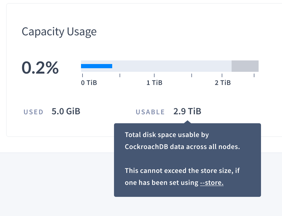
Definitions in the UI
Different databases use different terminology, so clear definitions matter. We heard from users that storage metrics in particular were confusing because there are a few ways those numbers can be calculated.
We started by adding tooltips that surface a definition and a link to the relevant docs. For example, hovering over a storage metric like ‘usable capacity’ brings up the full definition.
Next steps are to extend definitions across the rest of the UI and add more action-oriented guides for troubleshooting specific issues.
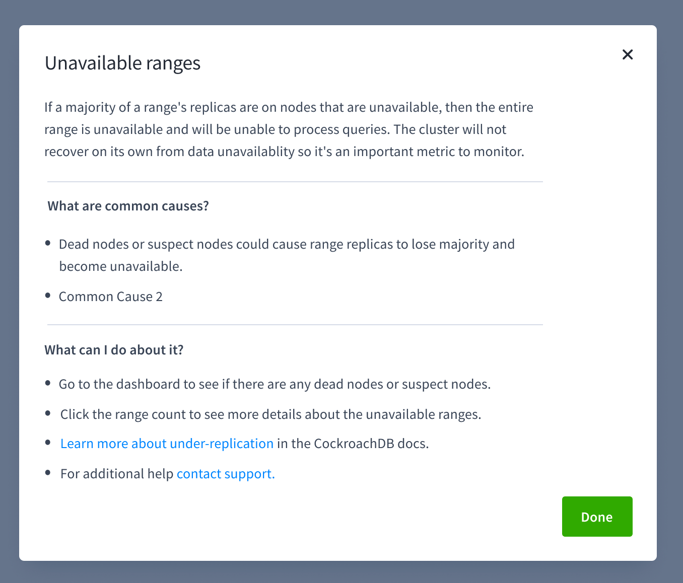
Empty states that guide users
Empty states are another good place for help text. We recently added the ability to download a statement diagnostics bundle for a SQL statement fingerprint. The bundle includes traces and other detailed information that help debug query performance.
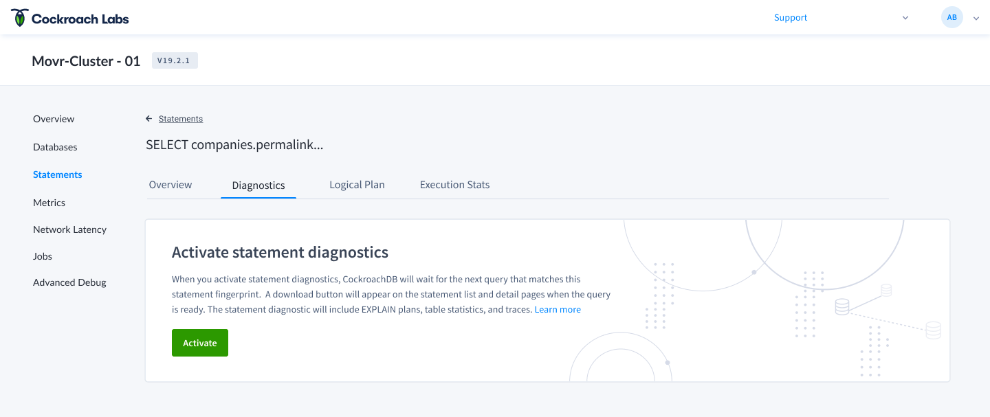
Diagnostics have to be activated explicitly, so they’re not available the first time the page loads. The empty state on the statement detail page walks the user through activating diagnostics and links out to the docs.
3. Test solutions early with coworkers
Designing database tools at Cockroach Labs means designing for developers with developers. We sit next to the people who use CockroachDB every day. We’ve learned to take advantage of that proximity by testing early.
Reworking the time selector
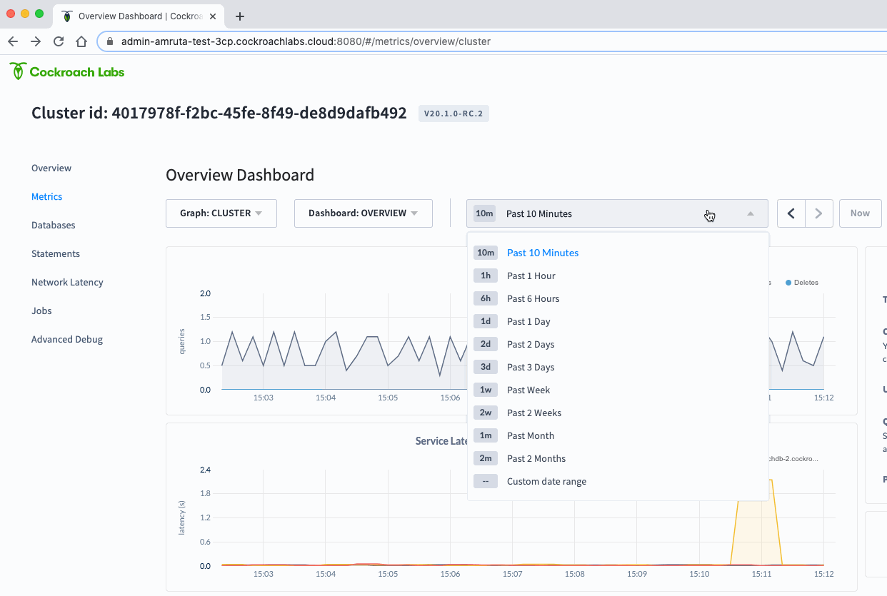
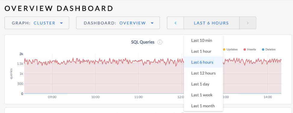
One of the known issues we wanted to address in the redesign was the time selector for metrics graphs. Those graphs help developers monitor SQL performance, replication, and storage metrics, and answer questions like “is any of my nodes running out of storage?” or “how are my queries performing?”. Most of the time, developers want to see metrics over a window so they can compare what’s happening now versus 10 minutes ago.
Our process looked like this:
1. Define the problem
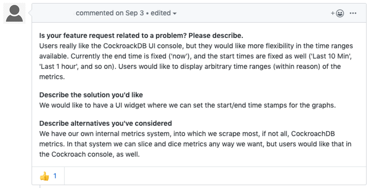
The original time selector only let users pick from a handful of predefined ranges and didn’t store the selection in the URL. That meant developers couldn’t view granular timeframes, share a snapshot with a colleague, or zoom into a small slice from days ago for a post-mortem.
2. Research
We reviewed tickets from customers and internal teams about UX issues with the time picker.
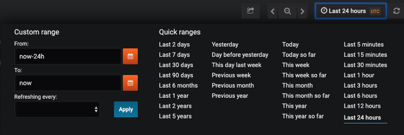
We knew other products had solved this, so we looked at Grafana, Datadog, and LightStep to understand common patterns for time series selectors.
3. Explore and test
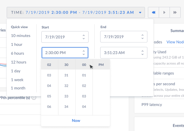
In version 1, we let users pick a predefined range OR a specific start/end time in the same view, with controls to step forward and back or jump to ‘now’.
We tested V1 with SREs (Site Reliability Engineers) on our team and found a few issues:
- 😡 Showing quick ranges and the calendar picker side by side overwhelms users. They feel like they have to fill out the dates to move forward.
- 😡 Users only reach for the calendar picker when they know a specific event happened at a specific time, which isn’t the most common case.
- 😡 Users intuitively want to interact with the graph itself: click-drag to zoom, scroll to pan.
- 😡 Custom date and time formatting was hard to read, and the controls jumped position when switching between predefined and custom ranges.
4. Iterate
Based on the feedback:
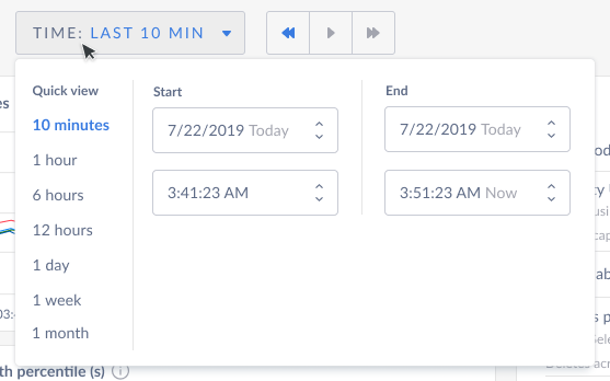
- ✅ Hid the calendar picker behind a link, since it isn’t the primary way users want to set a range.
- ✅ Made the time picker input fixed width so the controls don’t jump.
- ✅ Cleaned up date and time formats (dropped the year and seconds, used month abbreviations).
- ✅ Added a length abbreviation so users can quickly read the range they picked (e.g. 5w or 4d).
- ✅ Showed start and end calendars side by side in the custom picker, which takes fewer clicks and is easier to navigate.
Testing the first version with our SREs let us catch issues early and iterate before shipping to customers.